Montag, 19. Dezember 2016

Kai Schiemenz, "Steine/ Stones"

Solo exhibition
Galerie EIGEN + ART Berlin
2016


STONES! STONES?
It was probably only a matter of time before Kai Schiemenz, who trained as a stonemason, found his way back to stone – at least in the motto of his exhibition “STONES”. But he doesn’t fulfill this verbal promise “one to one”. You’ll seek in vain for hewn blocks here. But let’s look back briefly at Schiemenz’s large and small form composites of multicolored Styrofoam (2015/16). Didn’t they, too, always circle around the problematic of stone masonry? These rapid, almost sketchy constructions, steles, and pillars seem like playful replicas of the traditional slowness of working in stone, of its dignified gesture, and of irreversible decisions about form. Nothing about them is set in stone. In this way, the Styrofoam objects nonchalantly undermine the authority of stone in art and architecture.


But forward into the present: to the degree that Schiemenz not only presented such light objects autonomously, but also used them as molds for his newer cast glass objects – as transitional bodies, so to speak – he must have thought as much about stone as the trigger of. I deliberately write “trigger”, because we still do not see any stone sculptures in the current presentation, but a variety of other materials: ceramics, aluminum, wood, and glass, of course. Primarily opaque glass bodies in different colors. In its material compactness, glass comes recognizably closest to stone. And that’s not all: these are cast-glass replicas of artistically processed stones. The translation of the form from one substance to the other, alone, testifies to an achievement, demanding in terms of design as well as technique, as well as to pleasure in craftsmanship. But equally fascinating is the intellectual dimension of this decision, because the material, stone, however it is given shape, usually stands at the end of a creative process: after drawing and a clay or plaster model. But in Schiemenz’s current works, the stone, too, is a transitional body and not the concluding artistic statement.


This mental game with transformation undoubtedly began during Kai Schiemenz’s many years working in the glass workshop of Zdeněk Lhotský in Bohemia. Doesn’t the production of an artificial solid material of silicate and minerals repeat geological-historical processes in miniature? The encounter of substances whose metamorphosis through extreme heat and then cooling leads, in nature, to forms that can never be fully calculated. The analogical craftsmanship or industrial processing in glassmaking uses these chemical and physical reactions in a controlled way, but, especially with colored glass, a certain alchemical mystery nonetheless remains. Traditional recipes of the glassworks and glassmakers’ old experimental knowledge play a role. Liquefaction, the admixture of coloring metals or trace elements, the temperature, and the hardening do not necessarily lead to the desired results; this creative uncertainty always thrills Kai Schiemenz.


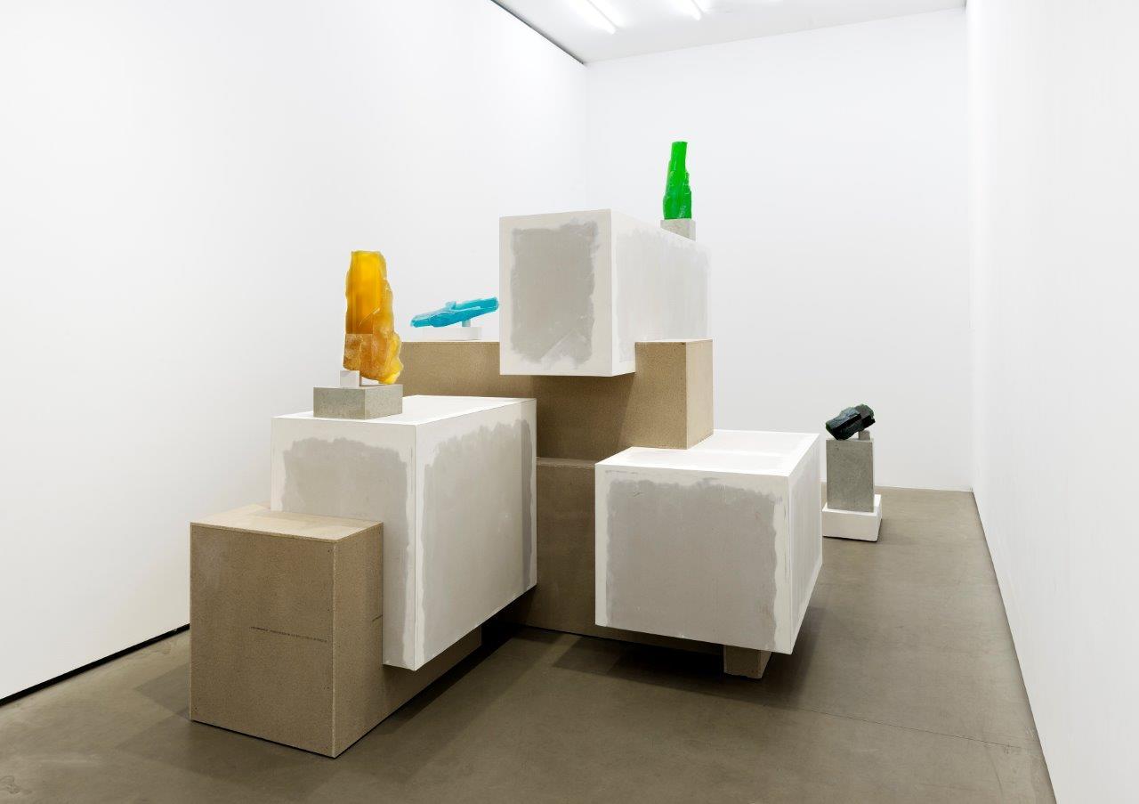
And here, too, the physically absent stone transcends its function as mere casting form, because Kai Schiemenz uses basalt that he found in a quarry in the Lusatia region. Like a classic sculptor, he drew geometrical forms out of these boulders. These cubes grow as if organically out of the basalt, and sometimes they interlock. Incompletely formulated, they sacrifice a possible perfection to the primal rawness of the stone. Basalt in particular is an astonishing natural form whose serial symmetry and formations that seem as if designed have long inspired artists and landscape architects. For example, in his Wörlitzer Park, Prince Leopold III of Anhalt-Dessau not only erected an artificial volcano, but also a veritable platform of basalt from Saxony at its feet. This served as both an aesthetic example of artful creation and as a natural-scientific specimen. By being set up beside the miniature Vesuvius, this installation includes a statement, a taking of sides in the 19th-century’s learned controversy between the Neptunist and the Plutonist School. Adherents of the latter were (rightly) convinced that this wondrous stone was not, as their adversaries claimed, oceanic sedimentary stone, but rather abruptly cooled magma. This “basalt controversy” was only partly about proving who was geologically right; it was also about nothing less than the origin of the world – whether from the sea or from fire. So, basalt not only has an inspiring form symmetry, but also a cultural-historical dimension. Schiemenz’s choice of hard basalt and glass technology thus functions as a symbolic reference to its emergence from fluid. In addition, the artist arranges the objects in a landscape of pedestals. And after we have descended into it, we may feel a little as if we were in an (abstract) grotto. For this situation, Schiemenz skillfully uses the quasi-underground structure of the gallery space as a setting and associational signpost pointing into the interior of the earth.


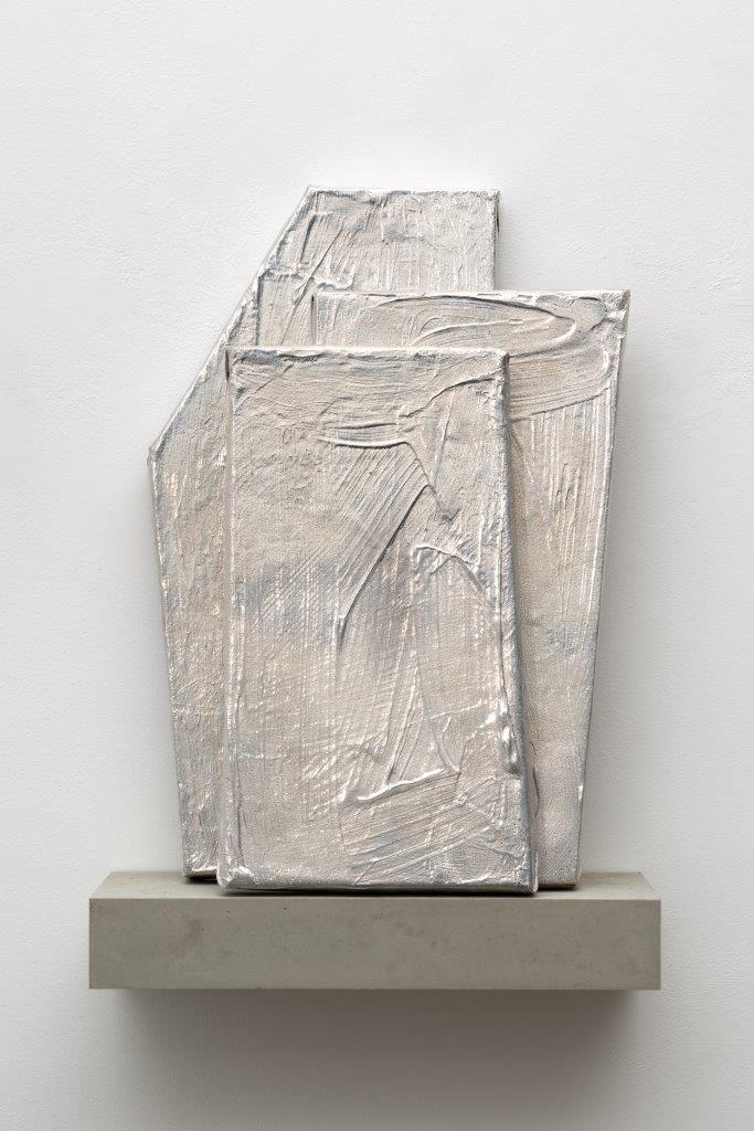
Along with the aforementioned protagonists – invisible stone and visible glass – the exhibition “STONES” offers further surprising material summersaults. The textured aluminum plaques, for example, are also cast “translations” of wooden panels coarsely trowelled with structure paste. Kai Schiemenz calls them “technically produced pictures in which the artistic act initially appears extremely reduced”. The ensuing casting in a shimmering material offsets this impression, of course, especially because more sensations occur on the surface. Schiemenz lays colored geometries over it; their matte finish seems oddly familiar. Right: we know this finish from everyday life, from banal objects with would-be glamour: ice cream tubs, siphons, flashlights, ballpoint pens… anodized (electrolytically oxidized) aluminum) is the magic formula with which Schiemenz stages his reading of Pop Art. He does not carry out his ennobling of the profane by holding consumer goods ichnographically aloft, but by using this technology that is seldom associated with art. He thereby remains true to himself as a keen-witted border crosser, because his appropriation of glass and ceramics successfully challenges the trivializing typecasting of such products as arts-and-crafts. No wonder: Kai Schiemenz’s passion is initially for the material processes and as yet unattempted metamorphoses – i.e., the respective process itself – and only afterward for the possible result. A true alchemist gains entry through the back door.

Text by Susanne Altmann

Translation by Mitch Cohen


http://www.eigen-art.com/index.php?article_id=1451&clang=1

http://kaischiemenz-blog.tumblr.com/


Sonntag, 31. Juli 2016

Kai Schiemenz »Bastion Beauté«, für den Lichtparcours Braunschweig 2016

Foto: Martin Simon Müller, Kai Behrendt


 Text: Kito Nedo

Seit der Industrialisierung ist Stahl einer der wichtigsten Baustoffe in der Architektur. Das aus Roheisen gewonnene Material übte nicht zuletzt deshalb große Faszination auf Ingenieure und Architekten aus, da es (neben Beton) die Ablösung von traditionellen Bauweisen in Stein, Backstein und Holz ermöglichte. So wurden völlig neue Baukonstruktionen und ungewöhnliche Formgebungen möglich. Weltberühmte Bauwerke wie der Pariser Eiffelturm (errichtet zwischen 1887–1889), die Golden Gate Bridge in San Francisco (Bauzeit: 1933–1937) oder die traditionell auf Stahlskelett-Konstruktion basierende Hochhaus-Skyline Manhattans sind Zeugnisse dieser Faszination für diesen modernen, zug- und druckfesten Baustoff, dessen klassisches Anwendungsgebiet das Tragwerk ist. Maßgebliche Moderne-Architekten wie Mies van der Rohe und Jean Prouvé waren Stahlbau-Virtuosen. Der Stahl trägt die moderne Bauindustrie bis in die Gegenwart – auch wenn heute zunehmend hybride Techno-Materialien die Architektur dominieren.
 
In der Kunst wiederum scheint Stahl – abgesehen von Ausnahme-Künstlern wie Richard Serra – nicht unbedingt zu den bevorzugten Stoffen zu zählen. Im Gegenteil: Künstler begegnen dem Material mit sehr viel Respekt: „Alle sind sehr vorsichtig, denn das Material hat ein hohes Gefahrenpotenzial.“ erklärte etwa der kalifornische Konzeptkünstler Chris Burden einmal in einem Interview.[1] Für Burden war der I-Träger der Grund-Baustein der Kommerz-Architektur und die Machtverkörperung der Baubranche schlechthin, den es also in einer geschickten Drehung gegen die ihm selbst eingeschriebenen Effizienz-Gedanken zu richten galt. Für seine Performance-Installationen „Beam-Drop“ ließ Burden mithilfe eines Krans mehrere Dutzend Stahlträger aus großer Höhe senkrecht in eine Grube mit frischem Flüssigbeton fallen.
 
Auch der Berliner Künstler Kai Schiemenz begibt sich mit seiner Installation „Bastion Beauté“ (2016) über die Wahl seines Materials in das Feld zwischen Kunst, Architektur-Moderne und Kommerz-Architektur. Schiemenz verwendet die industriell genormten Stahlplanken als Grundstoff für seine „verlassene Baustelle einer unvollendeten Utopie“[2]. Doch aufgrund verschiedener Bearbeitungen und Verfremdungen des Baumaterials führt er eine neue und lockere Anmutung in die Szenerie, die mit Glanz und pastelligen Licht- und Farbspiegel-Spielen der traditionell grimmigen Grund-Konnotation des Stahls zu widersprechen scheint. Die stählernen Quadratrohre, I- und L-Profile wurden poliert, gepulvert (eine Form der Lackierung) oder mit verspiegeltem Plexiglas verschlossen – teilweise verbergen sich dahinter verschiedenfarbige LED-Leisten. So scheinen sie ihre Schwere zu verlieren. Der Künstler setzt auf gepflegte Eisdielen-Flamboyanz und einen fast heiteren Auftritt: „Bastion Beauté“ erscheint als bodennahes, sich ständig veränderndes Farb- und Lichtspektakel, dass sich dem Publikum zu jeder Tag- und Nachtzeit als pulsierendes „Lavendel-Pistazie-Cappuccino-Aroma“[3] neu und anders präsentiert. Gibt es also so etwas wie die heitere Seite des Stahls? Die Theatralik ist verdampft, die Baustelle ist verlassen. Die große, stolze Modernismus-Erzählung hat Sendepause. Stattdessen sammeln sich in den lauen Sommernächten die Jugendlichen um das seltsam kühle LED-Lagerfeuer.
 Das Spiel mit stofflichen und sozialen Aggregatzuständen gehört zum Werk von Schiemenz: Feststoffe verflüssigen sich und Schweres beginnt zu schweben, Versammlungen konstituieren sich, um sich anschließend wieder zu zerstreuen. Der Künstler achtet darauf, dass im Prozess der Produktion wie der Rezeption immer genügend Raum für Zufälle und unvorhersehbare Ereignisse bleibt. Das bedeutet, dass eine Installation wie „Bastion Beauté“ nicht ausschließlich vom Ende her gedacht wurde, sondern das Ergebnis eines relativ offenen Prozess markiert. Schiemenz misstraut der restlos durchformten Gestalt, genau so wie der vorgegebenen Rezeptionsrichtung: „In der Kunst versuche ich oftmals Dinge zu realisieren, die nicht zwingend mit Gestaltung zu tun haben – auch wenn meine Arbeiten sehr formstark sind.“[4] Deshalb wurde eine zu starke geometrische Ordnung zugunsten einer gewissen Ungeordnetheit verzichtet (welche sich selbst natürlich auch innerhalb gewisser statischer Regeln bewegt). „Bastion Beauté“ soll ihr Publikum mit ihrem Leuchten überraschen – vielleicht ebenso wie das plötzliche Auftauchen einer elektrischen Dragqueen im Park.
 
Text: Kito Nedo

[1] „Not many artists have used steel. Everyone is very careful because the material has so much potential for danger.“ Quelle: http://evilmonito.com/2008/11/18/poetic-model-a-new-criticism-of-chris-burden/

[2] Unveröffentlichte Projektskizze Kai Schiemenz, PDF, 2015/16
[3] Unveröffentlichte Projektskizze Kai Schiemenz, PDF, 2015/16

[4] Atelier-Gespräch, April 2016
 
 
Foto: Martin Simon Müller, Kai Behrendt
 
 
KAI SCHIEMENZ
BASTION BEAUTÉ

by Kito Nedo

Since the industrial revolution steel has been one of the most important building materials in architecture. The product, extracted from pig iron, fascinated engineers and architects, not least of all because, (next to concrete), it allowed for a break with traditional construction practices in stone, brick, and wood. Entirely new ways of building and unusual designs became possible. Internationally acclaimed buildings such as the Eiffel Tower in Paris (constructed 1887-1889) and the Golden Gate Bridge in San Francisco (construction 1933-1937) are outstanding examples of this development. And of course, the skyscrapers of Manhattan with their steel-frame skeletons, also famously bare witness to the fascination with this modern, tensile and pressure-resistant building material, its classic purpose, to provide load-bearing, support-rendering structure. Famous modern architects like Mies van der Rohe and Jean Prouvé were steel-construction virtuosos. Steel carried the construction industry into the present, and although hybrid techno-materials increasingly dominate architecture today, it remains a valuable building material. 

In art, however – apart from exceptions like Richard Serra – steel is not necessarily among favourite materials. On the contrary, artists approach it with the utmost respect: »Not many artists have used steel. Everyone is very careful because the material has so much potential for danger,« Chris Burden, the California concept artist explained in an interview.1 The I-beam for Burden was the primary building block of commercial architecture and the construction industry‘s absolute symbol of power. In an ingenious twist, it serves to regulate the self-proclaimed concepts of efficiency that he associated with this fundamental building component. For his performance installations, Beam Drop (1985) Burden used a crane to drop several dozen steel beams from a great height vertically into a pit of fresh liquid concrete. 

Through the choice of his material for his installation Bastion Beauté, the Berlin artist Kai Schiemenz also moves between the fields of encompassing art, and modern and commercial architecture. As the fundamental unit for his »abandoned construction site of an unfinished utopia,«2 he used industrial standard steel planks. By applying various manipulations and distortions, he introduces a fresh and unconstrained appearance into his presentation which, with its luster and play of reflective pastel light and color, contradicts the traditionally and typically grim connotation of steel. The quadratic steel tubes and I-beams were polished, pulverized (a form of painting) and sealed with translucent- reflective plexiglass. Behind some of them, he has hidden different colored LED strips, diminishing their inherent severity. The artist places emphasis on a sophisticated ice cream parlor flamboyance and an almost mirthful presentation. Bastion Beauté appears as a ground-level spectacle of constantly changing color and light. Visitors can experience its vibrant »lavender- pistachio-cappuccino flavor« 3 with its ever new and changing guises , any time of day and night. So is there any such thing as the lighter side of the steel? Theatricality evaporates, the construction site remains. The epic proud modernist narrative takes a rest. Instead, young people gather on the warm summer nights around this strange, cool LED-campfire.  

Playing with physical and social aggregate conditions belongs to Kai Schiemenz‘s work: what is solid becomes liquid, what is massive begins to float, assemblages construct themselves and then disperse again. The artist makes sure that in his process of production, as well as in the reception of his works, that there is always enough room for coincidences and unforeseen events. An installation like Bastion Beauté is not exclusively conceived from its end but instead is the result of a relatively open process.

Schiemenz completely distrusts forms that are worked out down to the last detail and makes this very clear in a viewing statement: »In art, I often try to realize things that do not necessarily have to do with design – even if my works are very powerful in their form.«Therefore, he forgoes an overly dominant geometric order for a veracious disorder (which naturally moves within certain rules of static). Bastion Beauté with its luminescence should surprise its viewers – perhaps even as beautiful as the sudden appearance of an electric drag-queen in the park.

1 »Not many artist have used steel. Everyone is very careful because the material has so much potential for danger.«
2 Unpublished project sketches Kai Schiemenz, PDF, 2015/16.
3 Unpublished project sketches Kai Schiemenz, PDF, 2015/16.
4 Studio conversation,


Foto: Martin Simon Müller, Kai Behrendt


Kai Schiemenz, "Große und Kleine - Pistazie/ Malve / Koralle" Part II

18.03.2016 - 11.12.2016 Städtische Galerie Wolfsburg


„Archiskulptur“ umschreibt wohl am besten, was der 1966 in Erfurt geborene und in Berlin lebende Künstler Kai Schiemenz in der Städtischen Galerie Wolfsburg präsentiert. Der Meisterschüler von Lothar Baumgarten arbeitet mit den Medien Zeichnung, Computergrafik, Modellbau, Architektur und Installation. Für Wolfsburg hat er sich raumgreifende Installationen vorgenommen, er will die Räume der Städtischen Galerie in ihrer Wahrnehmung aufbrechen, gewohntes Sehen und Erleben unterwandern. Sein Interesse gilt gesellschaftlichen Fragestellungen zu Stadt, Raum und Architektur. Was machen sie mit uns, welche Beziehungen haben wir dazu? Drei Räume bespielt er in Wolfsburg: große Styroskulpturen füllen den ersten Raum, der zweite dient ihm als Plattform für seine kristallinen, farbigen Glasskulpturen und großen Keramiken und im dritten Raum hat er ein 6 Meter langes Display platziert, das als Sockel für seine kleinen Styroskulpturen dient.
Die Ausstellung wird unterstützt von der Niedersächsischen Sparkassenstiftung und der Sparkasse Gifhorn-Wolfsburg.

Kai Schiemenz "Große und Kleine - Pistazie / Malve / Koralle"
Ausstellungsansicht Städtische Galerie Wolfsburg © Kai Schiemenz,
Courtesy Galerie EIGEN + ART Leipzig/Berlin, Fotos: Uwe Walter, Berlin